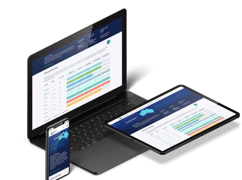
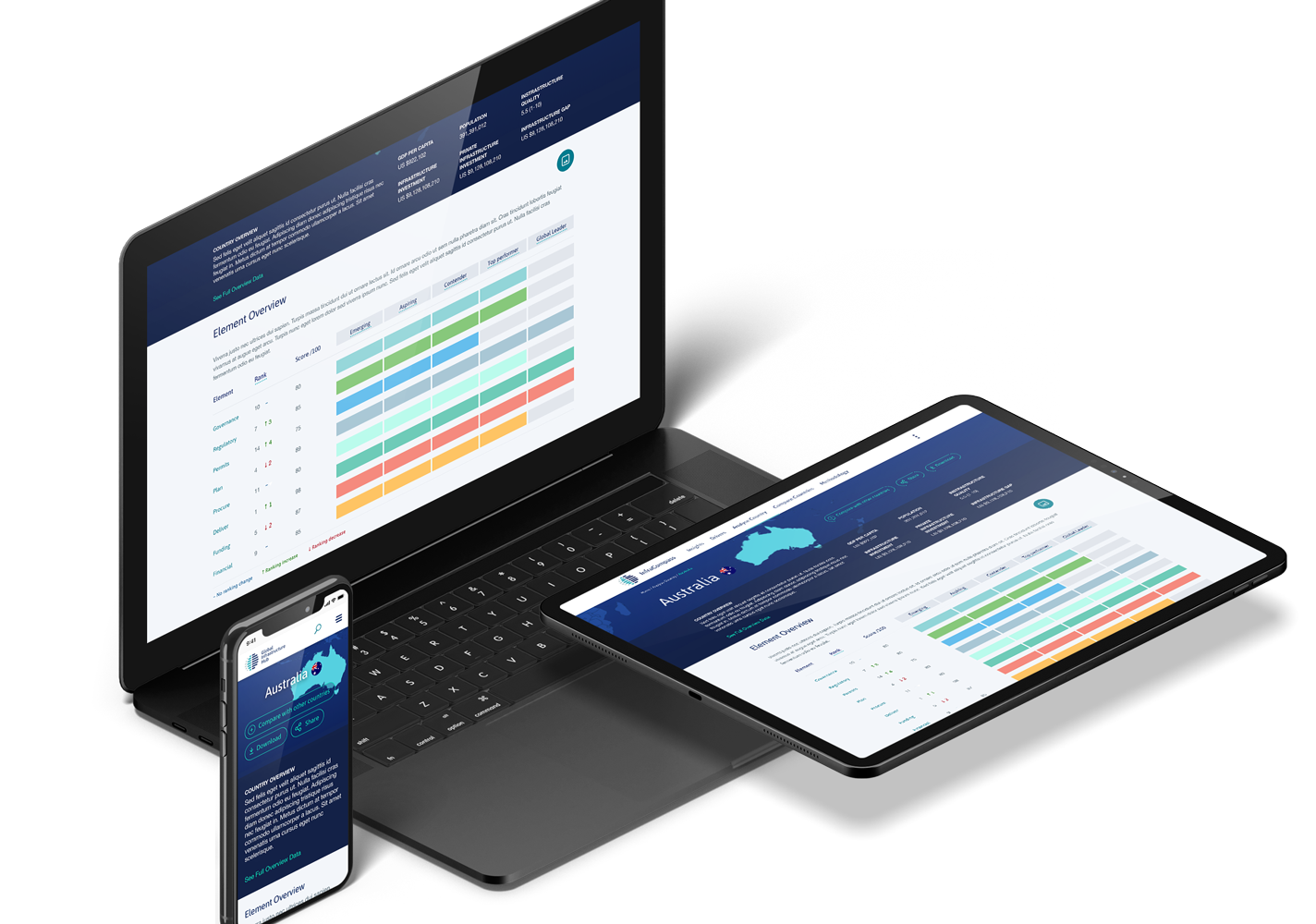
InfraCompass is one of the online tools we have worked together with GI Hub to create. Through data visualisation, users can analyse and draw conclusions from large sets of data to guide their decision making when planning infrastructure projects.
Creating InfraCompass
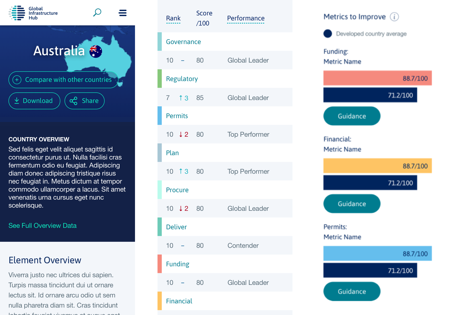
The InfraCompass 2020 report is a document that contains data and analysis from 81 countries in order to drive global improvements in infrastructure. Previously there were also 2017 and 2018 versions of the report. These three reports provide data points that show trends in global infrastructure over time.
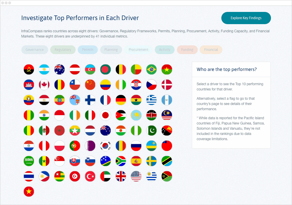
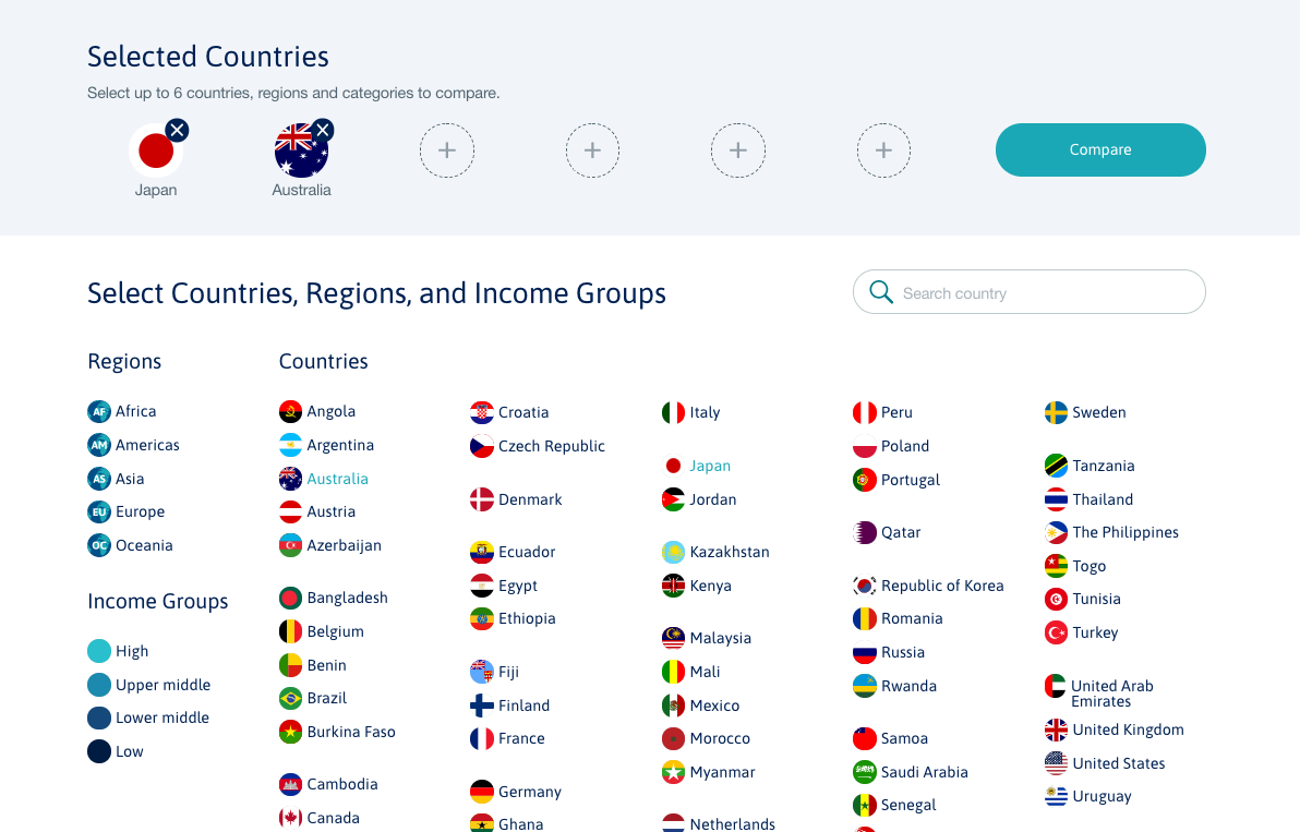
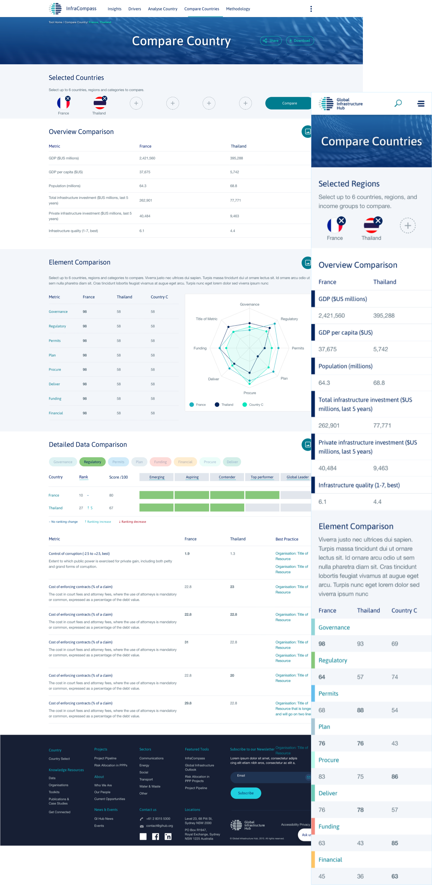
Our task was to turn these reports into an online tool where users could explore the data in focussed ways. While the report was a comprehensive look at each country individually, it was not suitable for data comparison. Our InfraCompass website not only allowed for this comparison but it was also designed so that you could focus on different aspects of the report and customise the data comparison to your needs.
Working closely with GI Hub, we looked at the data and considered what type of graph or table would work best for the different sections of the report. The final result is a website that is easy to use with engaging forms of data visualisation.
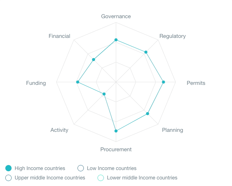
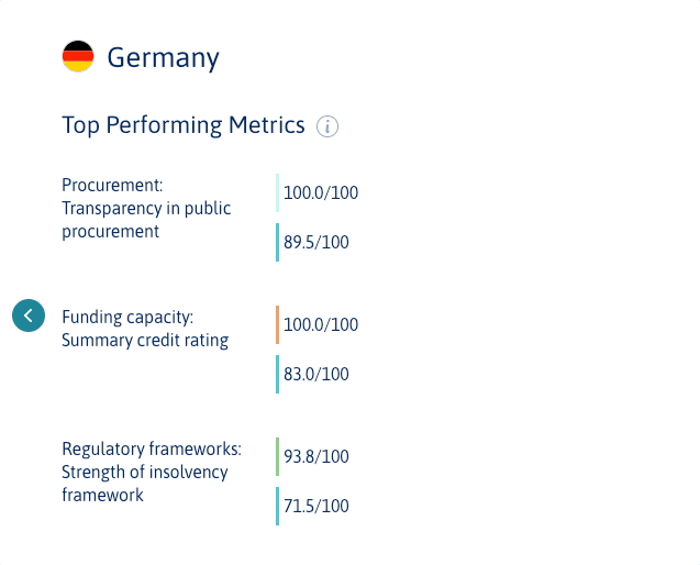
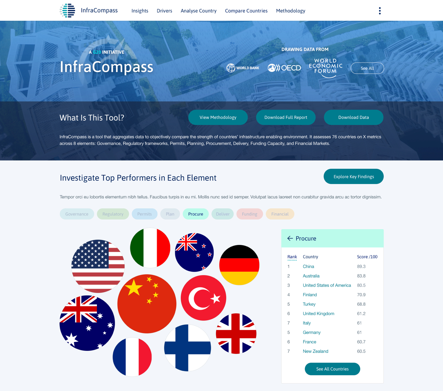
Carefully chosen graphs and table structures to best present certain types of information.
Interactions that lets users explore large amounts of data in focused ways.
Presenting data in engaging and varied ways was essential so that the tool did not look static.